Colors
Teal and Orange Wedding Colors: 6 Palettes with Hex Codes
For teal and orange wedding colors, choose deep teal with burnt orange for fall, bright teal with apricot for summer, or sea glass with peach for a softer spring look. Dark teal and copper suits winter evenings; midnight teal with orange gives a formal reception a bolder accent. The six palettes below include exact hex codes and neutrals to carry through your flowers, linens and attire.
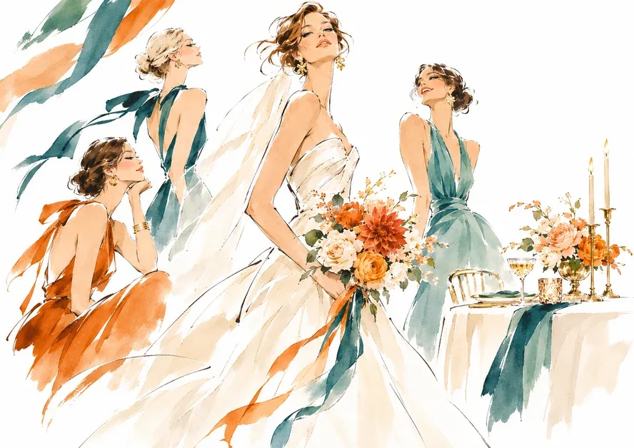
Six teal and orange wedding color palettes
Each palette has a teal, an orange, a light neutral and a fourth color for details. These are suggested combinations, not a paint or fabric brand’s color collection. Use the hex codes to share your choices, then compare physical swatches under your venue’s lighting. A screen value cannot promise an exact fabric match. Gold, copper and champagne codes suggest a hue, not a metallic finish.
| Palette | Teal | Orange | Light neutral | Detail color | Best for |
|---|---|---|---|---|---|
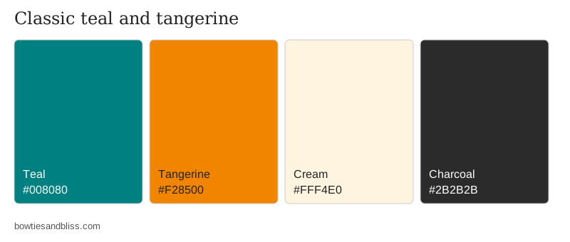
| Classic teal and tangerine | #008080 | #F28500 | Cream #FFF4E0 | Charcoal #2B2B2B | Any season, casual or formal |
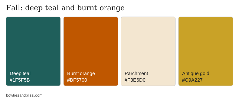
| Deep teal and burnt orange | #1F5F5B | #BF5700 | Parchment #F3E6D0 | Antique gold #C9A227 | Fall |
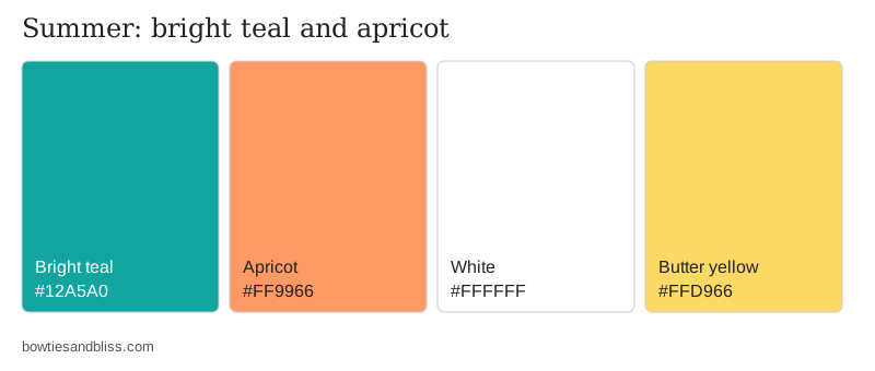
| Bright teal and apricot | #12A5A0 | #FF9966 | White #FFFFFF | Butter yellow #FFD966 | Summer, outdoor |
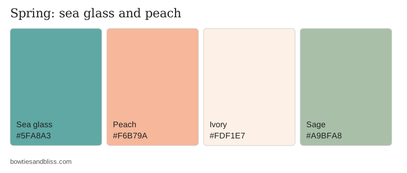
| Sea glass and peach | #5FA8A3 | #F6B79A | Ivory #FDF1E7 | Sage #A9BFA8 | Spring, daytime |
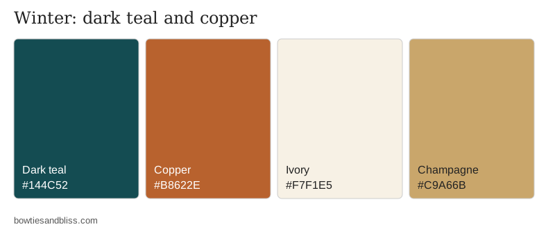
| Dark teal and copper | #144C52 | #B8622E | Ivory #F7F1E5 | Champagne #C9A66B | Winter, evening |
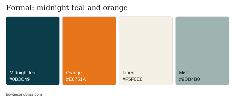
| Midnight teal and orange | #0B3C49 | #E8751A | Linen #F5F0E6 | Mist #9DB4B0 | Formal, black tie |
For spring and summer daytime weddings
Sea glass and peach is the gentler option. Let ivory linens cover most of the table, with peach flowers and sea glass napkins. Choose bright teal and apricot if you want stronger color outdoors; white keeps that combination crisp, while butter yellow adds another warm detail.
For fall and winter evenings
Deep teal and burnt orange brings brown-orange tones together with parchment and antique gold. Dark teal and copper takes the same idea darker, with ivory and champagne details. Use the former for an autumn look and the latter if you prefer a darker winter palette.
For a classic pairing or a formal reception
Classic teal and tangerine keeps both colors saturated, with cream and charcoal to balance them. Midnight teal and orange gives you the darkest teal in the table. Pair it with linen-colored stationery and mist-colored details for a formal setting.
Keep menus and signs readable
The colors can work together in decor without working as text on a background. Calculated from the hex codes above, teal against orange gives:
- 1.4:1 for bright teal on apricot
- 1.6:1 for deep teal on burnt orange
- 1.8:1 for classic teal on tangerine
- 4.0:1 for midnight teal on orange
The WCAG 2.1 minimum contrast thresholds for digital text are 4.5:1 for normal text and 3:1 for large text. None of these six teal-on-orange pairs reaches 4.5:1. Those are screen standards, so use them as a starting point for stationery, then check a printed proof.
For menus, put dark lettering on the light neutral. Deep teal on parchment is 6.0:1 and midnight teal on linen is 10.5:1. Classic teal on cream reaches only 4.4:1; use that palette’s charcoal for small text instead.
Flowers by season
Let linens, dresses or glass carry the teal, and use flowers for orange and neutral tones. The U.S. seasonal calendar from wedding florist Poppy Flowers suggests these starting points:
- January through May: ranunculus for orange accents, alongside garden roses.
- July through mid-October: dahlias, with peak availability in August and September. Peach and copper-orange varieties suit the lighter and darker palettes respectively.
- Fall into winter: chrysanthemums; some varieties are available year-round.
For June or a winter date, you can also build around cut roses. David Austin lists its wedding cut roses as available through florists year-round. Its Juliet rose offers peach-to-apricot shades; Effie has apricot and orange tones with ivory outer petals.
Poppy’s calendar is a national guide, and regional seasons differ. Give your florist the wedding date and color swatches together, so substitutions preserve the shade you want. A peach flower can suit the sea glass palette beautifully and still be the wrong choice for a burnt-orange bouquet.
Linens, attire and tables
For a stronger teal-and-orange table, choose a teal cloth with orange napkins or a runner. If you already have neutral linens, use those as the base and bring both colors into smaller details. Plan one table before ordering for the room; the centerpieces on a budget guide can help you work through the centerpiece options.
For attire, teal or neutral dresses with orange bouquets keep the brighter color in smaller accents. If you prefer orange dresses, use teal in ties or pocket squares to carry the pairing across the wedding party. When asking bridesmaids, include your color choices with one of these bridesmaid proposal ideas. For a small DIY project, try the palette on place-card tags before committing to larger decorations.